
(Winamp, once famous for its user skins)
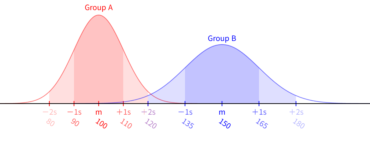
UX is not a singular but a distribution
The term "User Experience" is singular. One user, one experience. So we often treat UX as a question of how a single user feels about a product.
That's wrong.
In reality, UX is the distribution of how N users feel about a product. Not the experience of one user, but a statistical object that aggregates the experiences of all users. It has a mean, a variance, tails, and outliers.
This distinction may seem minor. Yet it is the starting point that determines everything else in this post.
We cannot design a distribution
We cannot directly design a distribution. What we can build is a single interface: one button placement, one color, one form structure. But that single interface is received by N users, and each of those N users is a different point in the distribution.
What we are actually doing, then, is
deciding where in the distribution to position the interface.
In most cases, we place that point near the mean, because the mean seems like "the point that satisfies the most people." But the mean ignores variance. And the greater the variance, the less precisely the mean fits anyone.
When N is small versus when N is large
The nature of this problem changes depending on the number of users.
When N=10, the mean is close to almost every user. If the preferences of 10 people are reasonably similar, an average design fits all 10 well enough. In this case, UX design works relatively well.
When N=10,000, the situation is different. The user distribution grows more diverse. Some people want minimalism; others want information density. Some want a fast workflow; others want guidance. If you take the mean of these two groups, you get a design that is neither minimal nor information-dense, neither fast nor sufficiently guided — awkward for everyone.
This is the precise definition of what we commonly call "generic" design. It is not the result of a designer's incompetence. It is a mathematical outcome of designing for the average.
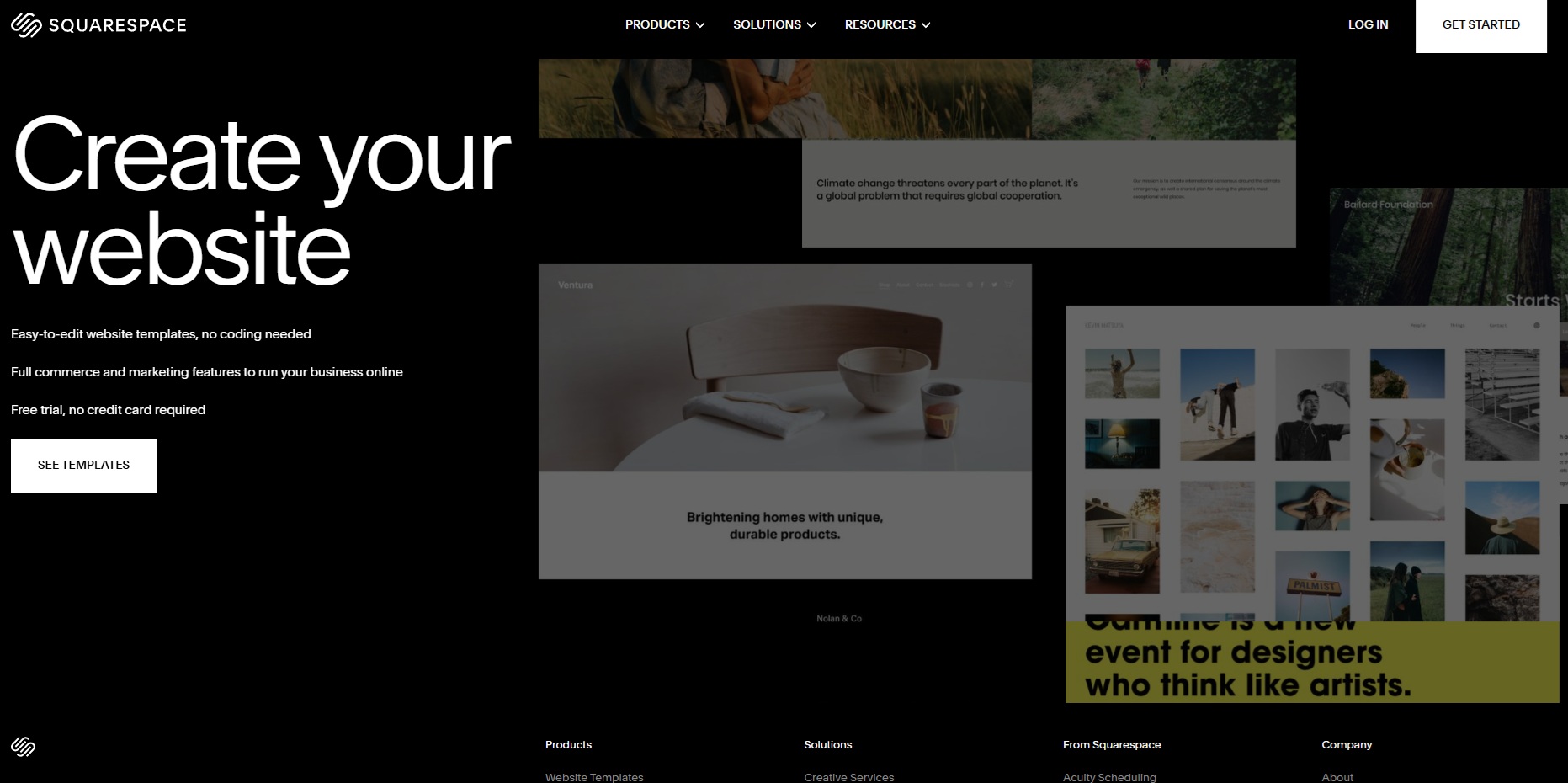
Why site builder designs are generic
If you look at the templates from site builders like Squarespace, Wix, or Webflow, most of them look remarkably similar: the same structure, comparable fonts, familiar color palettes, and predictable section flows.
Is this because site builder designers are lazy or unimaginative? You might think so. It's easy to dismiss other people's work.
Personally, I see it differently. The most fundamental reason is that the user distribution they must serve is far too wide: lawyers, yoga instructors, restaurant owners, B2B SaaS founders, people building a wedding page,
and when you take the average of all those people, the result is inevitably a design that looks like you've seen it somewhere before.
Why does the design end up this blurry? Strong preferences polarize users. In the end, this is simply the mathematical limit of average design: the wider the user distribution, the blurrier the average becomes.
So why do users accept generic design? (the demand side)
This raises a question. If average design is awkward for everyone, why do site builder templates survive in the market?
Shouldn't users reject them?
The reason this question even arises is that we are implicitly operating on a flawed assumption:
the assumption that users are discrete points, each with a clearly defined preference.
In reality, that is not the case.
Most people do have preferences. That much is true. People know, to some degree, what they like: "I like clean layouts," "something warm," "I prefer simple." At that level, preferences are fairly clear.
But the resolution of those preferences is low. How clean, what kind of warmth, simple in which dimension — the details are empty. The users themselves don't know.
So when a user encounters a new design, what actually happens is
not the discovery of a pre-existing taste, but the filling-in of empty detail. And that filling-in itself triggers dopamine.
"Oh, I like this" is, in reality, the novelty of seeing something for the first time, yet the user interprets it as having discovered their own taste.
When a user says "this design matches my taste," the overwhelming majority of the time it is not a genuine discovery of a prior preference but post-hoc rationalization.
This mechanism explains why generic design survives.
Generic design feels like something you've seen before. Even on first exposure, users feel a familiarity, as though they've already encountered it, and that familiarity translates into a sense of safety. So users have no complaints. The dopamine hit is weak, but there is no rejection either.
A novel design is the opposite. It produces a strong dopamine response, but carries the simultaneous risk of rejection. If a user's already-formed detail clashes with what they see, they reject it outright.
The designs that survive in the market are therefore variations on the familiar: not entirely new forms, but shapes that feel like something seen before, with just a touch of differentiation added. This is exactly the formula behind site-builder templates, and more broadly, the formula behind most commercial design.
One could dismiss this as mere inertia or conservatism in the design world, but it can equally be read as a rational response to the inertia of user cognition that the market demands. Design that feels familiar is inertial, and that inertia is the safest default operating in the market.
Data shows you the distribution, but it doesn't make the choice for you
Here an important distinction appears.
Data can reveal a distribution. A/B tests, user interviews, heatmaps, session recordings: all of these tools measure distribution. Which user group gets stuck where, which design is understood more quickly, which color gets more clicks.
What data cannot tell you, however, is which distribution to prioritize.
If design A satisfies 60% of users and design B satisfies a different 40%, which do you choose? Data does not answer that question. It merely shows which distribution each design works for.
The problem runs even deeper. If users themselves don't know the details of their own preferences, there is no way the data can know them either. A response in a user interview like "I like this kind of design" is likely the post-hoc rationalization the user came up with in that moment. Data doesn't measure users' true preferences; it measures the rationalized answers users produced at the moment of measurement.
That choice is a value judgment. You must decide which users to prioritize, which users to discard, and how to fill in the details that data leaves blank.
And someone has to make that decision.
Good UX means discarding segments
There is a fact that most UX discourse avoids: good UX is not design that satisfies everyone but design that consciously discards certain segments.
Apple's products explicitly discard price-sensitive users. Vimeo ceded the vlogger market to YouTube and focused on filmmakers. Notion initially discarded casual note-takers and focused on power users (though it is now expanding again). Good products always discard someone.
Design that discards no segments ultimately converges on the average. And the average fits nobody exactly.
Design that leaves everyone moderately dissatisfied. Site-builder templates are like this, enterprise SaaS UIs are like this, and government websites are like this.
The decision to discard a segment is always political. It means deciding which users are more valuable and whose experience to sacrifice for whom. And this decision cannot be delegated to data. It requires someone's judgment.
The UX distribution is also geographically fragmented
So far, this post has treated the distribution as a single statistical object. But in reality, the distribution is far more complex than that. It is a plurality of distributions, separated geographically.
Once this dimension enters the picture, the limits of average design deepen by another level. The average not only ignores variance; it must also decide which region's average to target in the first place.
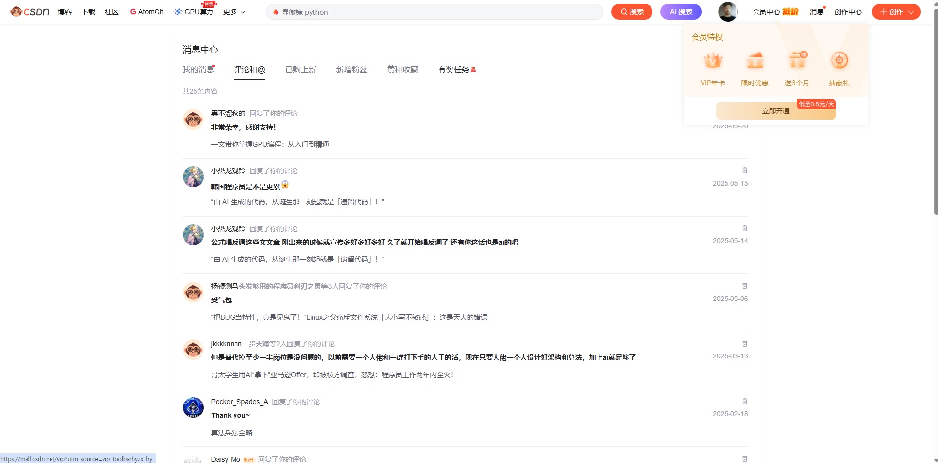
(The UI of CSDN, one of China's largest information sites)
Color meanings are culturally dependent
Consider red. The same color occupies a different point in the distribution depending on the region.
In Chinese UIs, red signals luck, prosperity, and celebration: the red envelope at Lunar New Year, the red dress at a wedding, the color said to attract wealth. As a result, Chinese e-commerce sites fill their sale banners, points-accrual notifications, and CTA buttons with red.
Users receive it as a positive stimulus.
In Western UIs, red is the opposite: danger, warning, error. Stop signs, red alert messages, delete buttons. Show the same red CTA button to a Western user and it feels aggressive or like a warning.
It is the same color, but where it sits in the distribution is reversed across cultures. When designing a "red button" for a global product, you first have to decide which distribution's center you are targeting.
There is also an asymmetry in information density and animation.
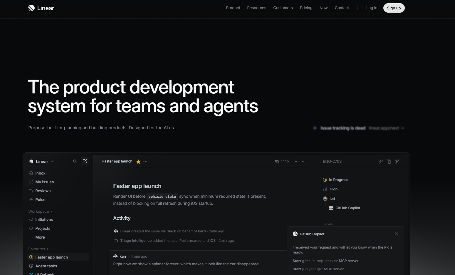
(Linear's homepage)
The design language of Western SaaS products such as Linear, Notion, and Stripe is minimalism paired with subtle animation. Information is refined, whitespace is generous, and interactions are handled with smooth transitions. Users read this as a trust signal: refined information equals a trustworthy product.

(Rakuten Japan's homepage)
East Asian e-commerce platforms such as Taobao, Rakuten, and Coupang take the opposite approach. Screens are packed with information, strong colors clash, and animations are stimulating: flashing banners, countdown timers, red price tags, yellow discount stickers. Users read this as the signal "So much information — it must be reliable!"
The same minimalist design reads as "trust" in the West, but as "lack of information" in East Asia. The same high-density design reads as "abundance" in East Asia, but as "spam" in the West.
Of course, part of this may simply be differences in taste among designers from particular cultures, but at the root of that taste lies the environment those designers have seen countless times, meaning that users' cognitive training differs. That training is the accumulated result of decades of e-commerce, advertising, and media environments.
The Power Signals in Microcopy
The linguistic dimension cannot be ignored either.
In English UIs, the imperative form feels natural: "Save," "Delete," "Submit," "Cancel." Because English is a language with a relatively flat speaker-listener hierarchy, imperative verbs function as neutral action labels.
Korean and Japanese work differently. The same imperative form carries a hierarchical signal, so designers avoid it by using noun forms like "저장" ("Save") and "삭제" ("Delete"), or the nominalized -기 form such as "저장하기" ("To save"). In Japanese UIs, the pure noun form "保存" is far more common than the verbal "保存する".
When taking on global projects, this kind of situation comes up frequently.
These subtle details hit particularly hard for people in specific cultural contexts, including the minority culture of programmers and designers. The question of how language encodes power relations is an enormously important and difficult point for developers taking on global challenges. English has a weak speaker-listener hierarchy, so the imperative form is neutral, but Korean and Japanese have strong hierarchies, meaning the imperative almost always carries some hierarchical signal. When a UI uses the imperative, it signals that the system is above the user.
So the same "Save" button is a neutral action in English-speaking contexts, but in Korean it subtly becomes the system issuing a command to the user. The same design sends different power signals across different language communities.
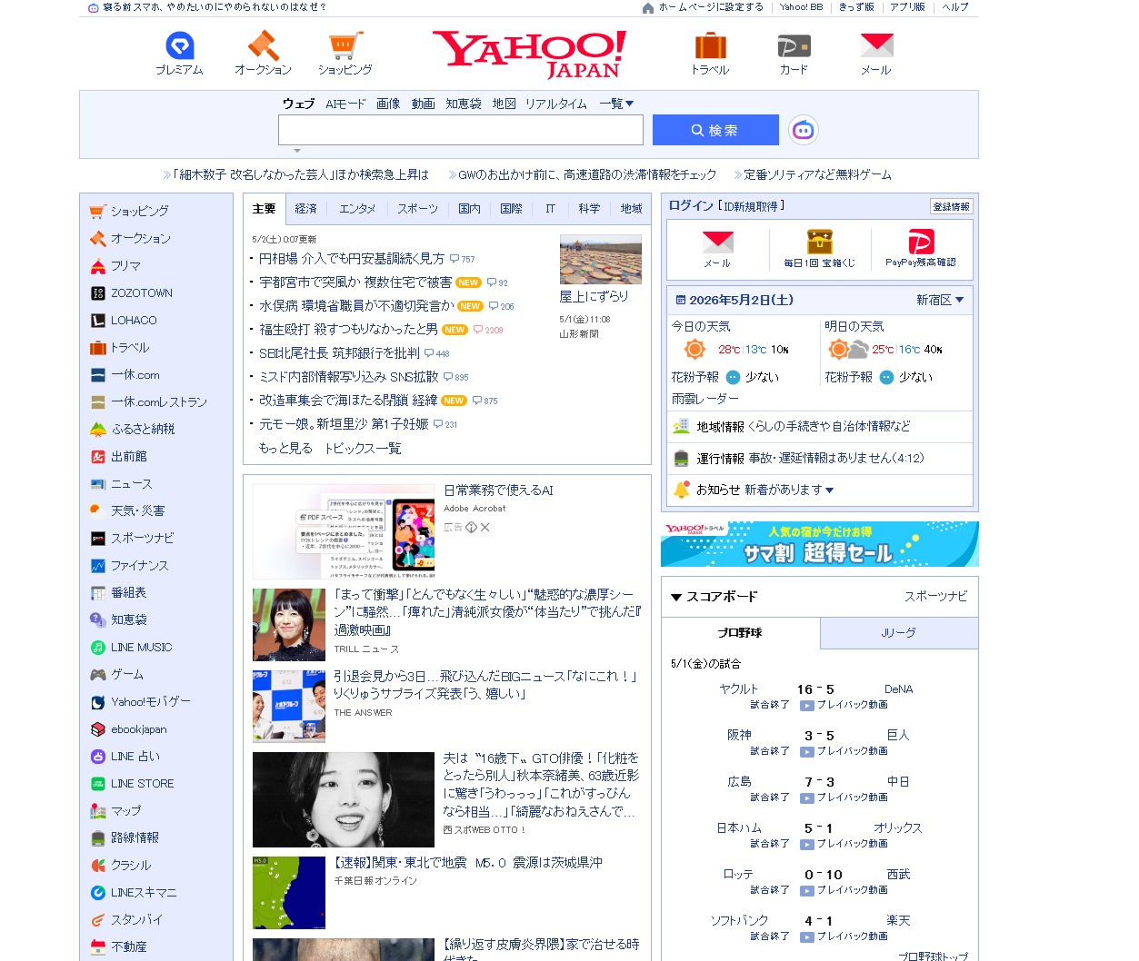
(Yahoo Japan)
The megaplatform lock-in effect
Cultural essentialism alone, however, does not tell the full story. There is one more dimension to consider: the design inertia of megaplatforms.
Chinese UIs look so similar not merely because of Chinese culture, but because megaplatforms like WeChat, Taobao, and Alipay have solidified a design language. Later designers follow that language because users have already been trained on it, and deviating feels off.
The same logic explains why Japanese UIs have high information density. Yahoo Japan and Rakuten set that tone, and subsequent products fell in line. When a new Japanese SaaS enters the market with a minimalist design, it gets criticized as "looking like it lacks information." The megaplatforms define the average.
Korea is no different. Naver, Kakao, and Coupang defined the average for Korean UIs, and products that stray too far from it feel strange to users.
"Culture-specific UX" is therefore a joint product of cultural essence and platform inertia. Neither factor is directly measurable for a global product. When a global product claims to "find the average," it remains unclear which average, made by which platform, in which region, it is actually targeting.
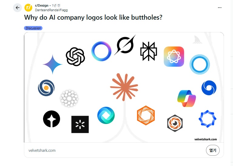
(Why do AI company logos look like buttholes?)
The most visible contemporary example is AI company logos. There is a post on Reddit's r/Design titled Why do AI company logos look like buttholes? ChatGPT, Claude, Gemini, Copilot, Perplexity, Mistral
all share the same visual grammar: circular or radial forms, gradients, and a sense of convergence. It was not by agreement among designers. OpenAI established the visual standard first, and subsequent products risk not looking like AI products if they deviate from it. So they follow. The very act of avoiding awkwardness produces an awkward homogenization.
Once an average solidifies too thoroughly, no one inside the market can escape it, because escaping means not looking like a product in that category.
Users' mental circuits are already aligned to the average, so they feel no discomfort while inside it. But someone outside the circuit sees it immediately. That is why a user on r/Design can notice, "Why do they all look the same?"
The opposite extreme: the design failure of total freedom
If megaplatform lock-in is one extreme, the opposite extreme also exists: design that gives users unlimited freedom. This approach has been tried multiple times throughout history and has almost always failed. From a programmer's perspective, this looks like an address-space design problem: a system with zero constraints has infinite degrees of freedom and therefore cannot meaningfully explore the state space.
Winamp skins (1997 to the early 2000s). Winamp let users freely design every visual element: button positions, sizes, shapes, colors, fonts — all of it was open. Tens of thousands of skins were created as a result, but most were unusable. They lacked readability, had ambiguous click targets, and were inconsistent. Freedom was demonstrated, but the products that freedom generated were mostly painful to look at.
MySpace profiles (2003–2008). This is the more extreme case. Users could inject arbitrary HTML and CSS into their own profile pages: auto-playing music, flashing GIFs, unreadable text colors, infinitely scrolling background images. Every page was different, yet every page was unusable. When Facebook arrived, the decisive reason Facebook won was the exact opposite strategy of eliminating design freedom entirely. Every Facebook profile looked the same, and that sameness functioned as comfort. Users accepted the removal of their freedom as relief.
These cases say one thing: give users unlimited freedom and the entire system collapses. Users lack the capacity to fill in the details of their own taste — recall the constraint noted earlier that user taste has low resolution,
and when unlimited freedom is given to users who lack that capacity, the result is not the expression of taste but the output of random noise.
For a designer, the canvas is infinite.
But a programmer cannot work that way.
On one side sits megaplatform lock-in: the failure where the average ossifies so completely that everything looks identical.
On the other side sit Winamp and MySpace: the failure where there is no average at all, so everything is different and simultaneously unusable.
Somewhere between those two extremes is where the design of programs that actually work lives. Today's Facebook, Reddit, and Twitter all offer constrained freedom. Users can fill in the content, but the platform locks down the visual vocabulary of the container. That structure is why these systems operate stably at scale.
From a programmer's perspective, this is a familiar pattern. Library API design faces exactly the same problem. Too many constraints and users cannot build what they want. Too much freedom and users hurt themselves. A good API is designed so that common things are easy and wrong things are hard. Design works the same way. Good design makes the right thing feel natural and the wrong thing feel awkward.
Cognition is trained
Start with this proposition: a user's sensory responses are not innate but the result of training.
Refusing to accept this leads straight into essentialism of the form "East Asians prefer high information density." That is wrong. An East Asian person encountering a Yahoo page for the first time in the early 1990s would have perceived it as information-dense. What feels natural today is the result of 30 years of accumulated exposure.
Raise the same person in a different environment for 30 years and a different set of sensory expectations forms. The advertising industry has proven this over a century, and it is a foundational premise of marketing research. Yet in UI design discourse it is, oddly, forgotten with surprising regularity.
Two Pathways to Trust Signals
When a user encounters an interface, two pathways typically activate as they assess is this product trustworthy?
Pathway 1: The signal of refinement. The judgment that "this product is well made" comes from the degree of refinement in the design. When whitespace is generous, typography is consistent, interactions are smooth, and there is no visual conflict, the user infers that the maker invested sufficient resources. Therefore it is trustworthy.
Pathway 2: The signal of abundance. The judgment that "this product is well made" comes from the information density of the design. When a single screen contains a lot of information, many options, numerous user reviews, and strong visual stimulation, the user infers that the maker put in sufficient effort. Therefore it is trustworthy.
Both pathways are rational, and both are attempting to measure the same underlying variable: the maker's investment. They differ only in which proxy they weight more heavily.
The question of which pathway activates is determined by the environment in which the user was raised.
How Refinement Became a Trust Signal in the West
Western design discourse was deeply shaped by 20th-century modernism: Bauhaus, Swiss Style, Dieter Rams's "Less but better." The core proposition of this movement is that the ability to remove what is unnecessary is the mark of a capable designer.
As this proposition was absorbed into advertising and mass media, Western users accumulated the following learned associations.
Premium equals refined. The whitespace on a Vogue cover, Apple's white background, Tiffany's minimal logo. The more luxurious the brand, the more it empties.
Cheap equals cluttered. The yellow price tags on a neighborhood supermarket flyer, cable TV infomercials, spam email. The less trustworthy something is, the more it fills.
After 30 to 50 years of this accumulated exposure, users' sensory circuits solidify into the conviction that refinement is what can be trusted. Western SaaS products trend toward minimalism not because of designers' personal taste, but because minimalism is what functions as a trust signal for users in that market. The fact that Stripe, Linear, and Notion all share a similar tone is not a coincidence; that tone aligns with the metric by which trust is measured in that market.
How Abundance Became a Trust Signal in East Asia
The East Asian pathway is different.
Traditional market culture: a shop where goods are piled high is a shop that is doing well. An empty shelf is read not as a sign that items haven't sold, but as a sign that the shop couldn't sell them in the first place. It is hard to trace exactly where this learning began, but at minimum, within East Asian market culture, the equation that density signals vitality and is therefore trustworthy is a deeply ingrained circuit.
Newspaper ads and e-commerce. Look at a Japanese newspaper ad from the 1980s and you'll find a page packed with information: every specification and price printed in small type. Korean e-commerce in the 1990s was the same. The early screens of Auction and Interpark had to fit everything on a single view.
Then the megaplatform delivered the decisive blow. Yahoo Japan became the standard for Japanese internet in the early 2000s, and its homepage was dense with information. The Japanese sites that followed matched that tone, because anything less looked like it was lacking information. Japanese users spent 30 years reinforcing the circuit that the denser a site, the more trustworthy it is. You can see this even today: walkthrough and strategy sites starting from Game8 tend to be remarkably high-density.
In Korea it was Naver. In China, Taobao and WeChat. The mechanism is the same across all of them.
Can we call this the essence of culture, or should we call it the accumulated result of environment? I think it is an acquired trait.
Even Japanese users in 1995 may have found the Yahoo homepage information-overloaded. Thirty years later, it has simply become the default.
The Dilemma of Global Products
Put all of this together, and the real dilemma of building a global product comes into focus.
A global product must decide which market's circuit to align with. Aligning with every market at once is impossible. When a red CTA drives purchases in one market but reads as a warning in another, there is no version of a red CTA that satisfies both.
There are three approaches.
Approach 1: Choose one circuit and abandon the others. This is the most honest approach. Apple explicitly chose the Western minimalist circuit and, in doing so, gave up e-commerce suitability in East Asian markets.
Approach 2: Branch the design by market. This is the most expensive approach. You build separate Japanese, Korean, and Western versions of the same product. It is what McDonald's does with its menu, applied to design instead. Companies with sufficient resources can pull it off.
Approach 3: Average across all circuits. This is the most common approach, and it produces the most generic results. A design that works tolerably in both the West and East Asia but fits nobody precisely. Site-builder templates are exactly this outcome.
All three approaches require a value judgment: which circuit to prioritize. And that judgment cannot be delegated to data. Data can measure the circuits, but it cannot tell you which circuit to put first.
This is where the concept of OX enters.
The person who decides which circuit to prioritize is the owner.
That decision depends on the owner's understanding of the market, the owner's background, and the owner's business ambitions.
A website is a compromise among three parties
A website is, in fact, built through a compromise among three parties.
Users: I want to get the information I'm looking for.
Business: I want to build brand trust and drive conversions.
Internal organization: I want the owner's tastes and preferences reflected.
People often say, "A website is for the user." In principle, I agree. But in reality, most users' "tastes" are ultimately shaped by brand reputation. And where does brand reputation come from? In many cases, it comes from the owner's taste and positioning, and from the accumulated decisions they've made over time.
A SaaS landing page is not simply a place where users come to get information. From the company's perspective, it is also a tool for imprinting their positioning into the user's mind.
This phenomenon is, at its core, a principal-agent problem.
When you actually work with clients, you find that most of them don't think about UX.
They think about OX — owner experience.
And in reality, most companies run on OX.
In the idealized narrative, everyone says they care about UX. But real businesses don't run on UX. They run on OX. The key question is whether the owner's tastes happen to be aligned with those of the general public.
Why does Gartner sell?
Why do people pay large sums of money for reports from companies like Gartner?
The game they play is close to a coin flip. If you look at the Gartner reports that are made public, they are wrong quite often. That is to be expected. Simplifying a complex system cannot always be right. The economy is a complex system. But human cognition is finite.
So why do reports from companies like Gartner sell?
Because they reduce the anxiety of owners and decision-makers.
Business is complicated. Even a bad product can succeed with the right advertising. Exaggerated marketing, fraud, timing, distribution, luck, and everything in between can all produce success. UX is an ideal. In practice, however, developers often have to satisfy OX instead.
Companies appear to pursue profit, since most owners like money. In reality, though, many companies are closer to the realization of an owner's ideology, taste, and worldview.
So what actually matters?
What matters to a developer is judging how closely the owner's taste aligns with the general public and with the target customer. This is also why developers so often end up flattering the owner. Simple hierarchy and the internal politics of career advancement certainly play a role, but the core reason is that the owner's taste is, in effect, the operating system of the business.
A note on the single-owner assumption
But a natural objection arises here.
"What about companies with multiple stakeholders? Unless you assume that everyone in the C-suite reasons similarly, doesn't this model fail to generalize?"
That is a fair point. The OX frame may look like a single-owner model, but at the meta level I think it can apply more broadly to companies with distributed stakeholders as well. It breaks down into roughly three patterns.
1. Safety-oriented OX
When no particular stakeholder or internal political faction holds a decisive advantage, the result is often a UI that moderately dissatisfies and moderately satisfies everyone.
This is not optimized for users. It is optimized so that no one inside the company bears political accountability for the decision.
This is probably the dominant pattern in many SaaS products. People often call it "generic" or "broadly applicable" design: stable, safe, hard to object to, but never sharply targeted. SAP and Oracle products are textbook examples of this form.
2. Faction-driven OX
Even when there are multiple people in the C-suite, most decisions are driven by a single faction, and that faction usually has a leader.
In this case, the UI becomes a combination of that faction's requirements. The result often manifests as inconsistent requirements across pages and flows.
In my experience, the product/planning side usually wins these battles. The marketing site gets optimized for the CMO-OX, and the billing system gets optimized for the CFO-OX. Rather than a single OX, multiple OXes partitioned by domain are operating simultaneously. The principal-agent problem doesn't disappear; it fragments.
3. Proxy-authority OX
When there is no internal owner with strong taste, the company imports taste from outside.
This is precisely why Gartner sells.
The McKinsey deck becomes the de facto OX. The "industry benchmark" report the board brought in becomes the OX.
The decision is no longer "What do users want?" It becomes "What does the proxy authority say?"
This is OX with the owner outsourced.
Limitations
To be clear, this is not a rigorous theory. It is an observation-based framework, and there are cases where it breaks down.
For late-stage public companies with dispersed shareholders and no strong management, this model loses predictive power. That said, even in such companies, internal conventions and institutional habits often end up being the actual drivers of decision-making.
I am not presenting this as a serious theory. If it were a real theory, it would need a statistical model built on actual data.
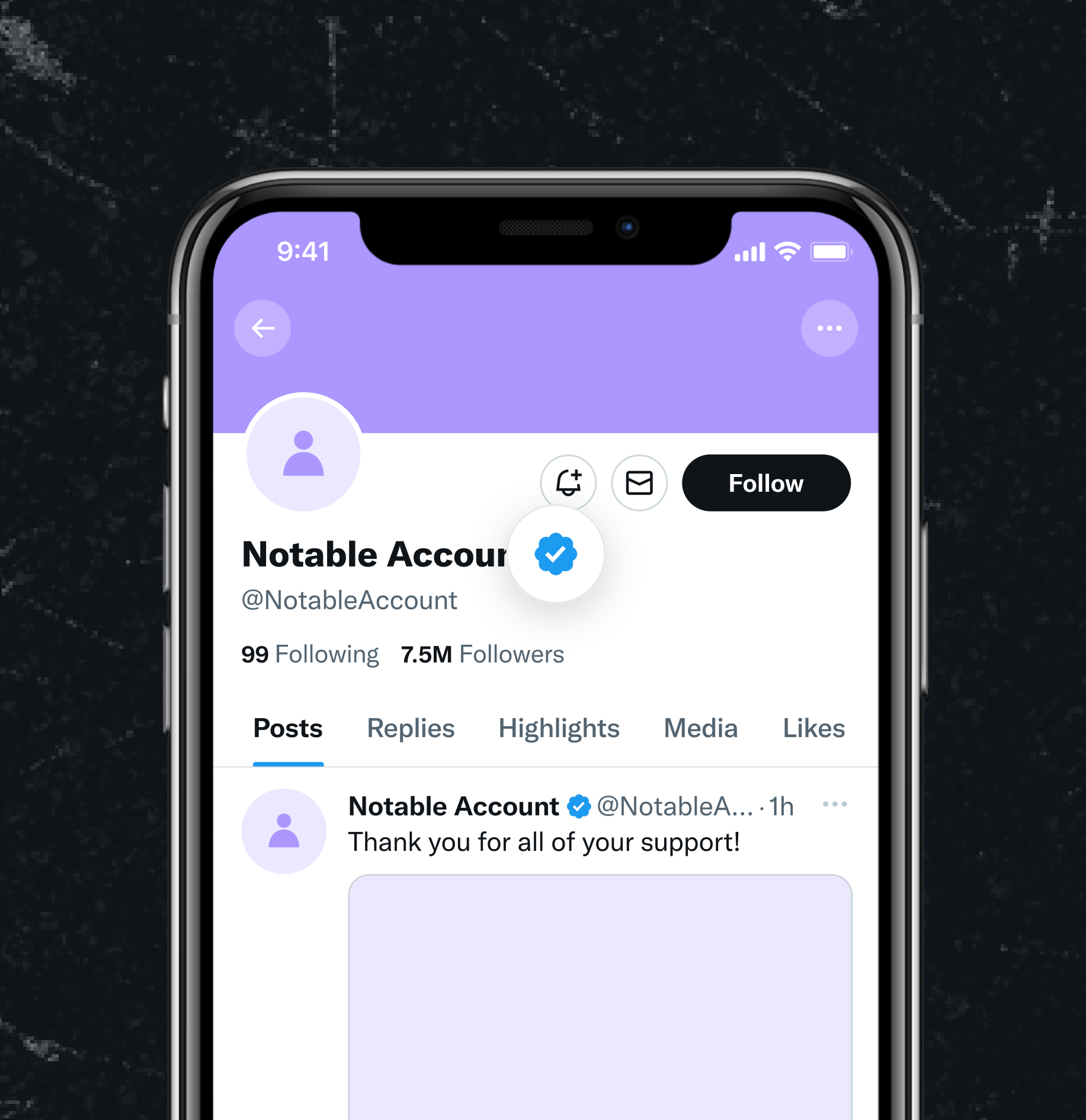
(Twitter blue check)
X (Twitter) as a Case Study
X is almost a textbook case of the OX theory. What makes it interesting is that X does not simply illustrate "a case OX ruined" but shows both sides of OX simultaneously.
Let's start with the clear cases where OX beat UX.
The blue check's change in meaning is the cleanest example.
In the Twitter era, the blue check was a verification signal meaning "this person is not an impersonator"
a pure UX function. Musk turned it into an $8/month subscription badge. From the user's perspective, a signal had become noise.
Impersonation surged, and the incident where Eli Lilly's stock dropped after a fake tweet offering free insulin happened shortly after. This is a decision that could never have come from UX analysis.
It could only have come from Musk's ideology that "verification should not be a privilege of authority but something anyone can buy." A textbook OX execution.
Force-boosting his own tweets in the algorithm falls in the same category. In February 2023, when his Super Bowl tweets got lower engagement than Biden's, he had engineers boost his own tweets 1,000x in the algorithm. From a UX standpoint, this is an obvious loss. But from an OX standpoint, it is perfectly rational.
The platform is the owner's megaphone, after all.
Renaming it X was no different. "Twitter" was a brand asset accumulated over 20 years, so embedded in the culture it had become a verb. Any marketing consultant doing a normal analysis would never recommend abandoning it. Yet Musk had been obsessed with the name X since his x.com days back in 1999. Was this really what users wanted? I think it was less about what users wanted and more about a 25-year-old owner's preference finally being realized. 1
And yet an interesting asymmetry emerges here.
Musk pushed his OX forward even as ad revenue dropped nearly 50% and the valuation collapsed from $44 billion down to the low teens, and he survived, to a degree.. This is the double-edged nature of OX.23
Inside Musk's OX there was a small but genuine UX model
the hypothesis that "the censorship of the old Twitter was a real grievance for a certain segment of users."
This hypothesis was not a universal UX, but it was the UX of a specific segment. Advertisers left, but certain user groups became more active, and X has been rolling along even in a zombie state. If Musk's OX had been pure self-indulgence
(for example, "I like pink, so I'll make the UI pink"), it would have collapsed long ago.
The X case shows that the "OX vs. UX dichotomy" is an overstatement. The accurate frame is this.
OX always embeds some UX hypothesis. The question is how accurate that hypothesis is, and how large a market it applies to. Musk's OX had a degree of accuracy, but the applicable market was narrow. So X sits in a gray zone where it neither collapses nor grows.
Steve Jobs's OX, by contrast, was both highly accurate and addressed a large market. Bezos's OX ("customer obsession") was itself isomorphic to UX. The OX of Korean SI company executives tends to be low in accuracy, and the market for it is shrinking.
The missing third option
Summarizing so far, it might seem like developers have only two choices: comply with the OX or leave.
But there is a missing third option: the work of bending OX in the direction of UX.
This is what good consultants, good PMs, and good senior developers actually do.

They make their own OX visible so that other people's OX aligns with it.
The core is "designing the desire."
Well-intentioned design creates an illusion in users that "I chose this."
This doesn't apply only to users. It applies to owners as well. What does an owner typically desire? The belief that I have the power to choose.
A well-designed system gives the owner that same sense.
However, that freedom of choice should not be absolute. Give someone complete freedom and the system breaks down quickly. Consistency collapses, and no one can restore the whole.
The core question is: "Where is the boundary that lets the owner feel they have a choice, while keeping the system from breaking down?"
This is nearly the only path to satisfying both OX and UX at the same time.
It is not about simply deferring to OX, nor about simply asserting UX principles, but about redesigning the owner's desire into a form that is compatible with good UX.
That is the stance a programmer must hold.
The question is how to persuade.